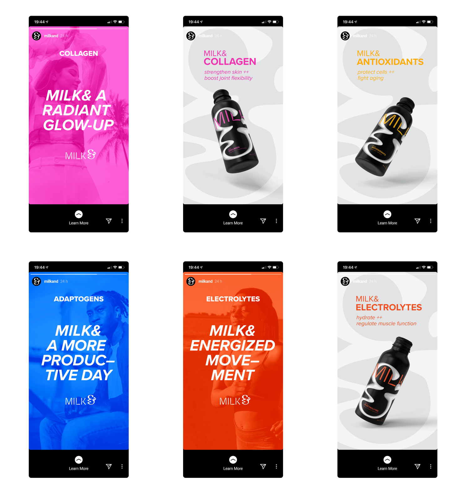
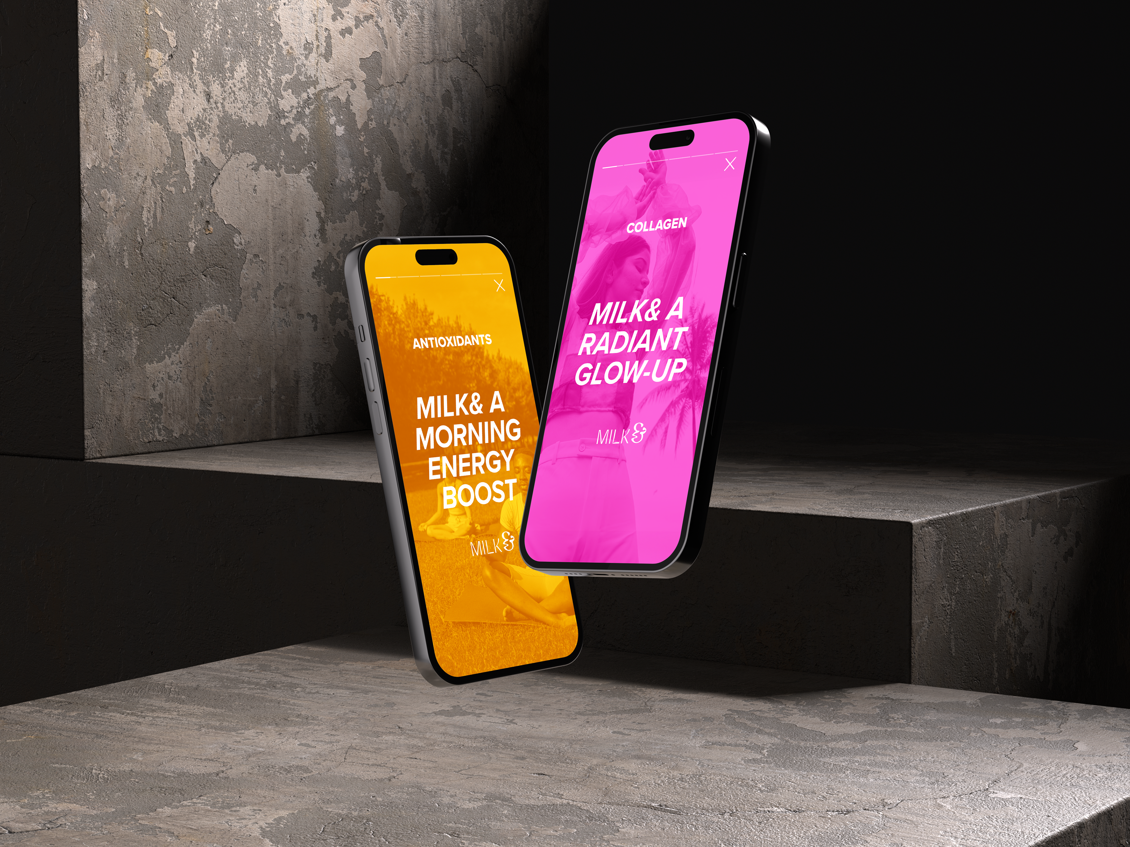
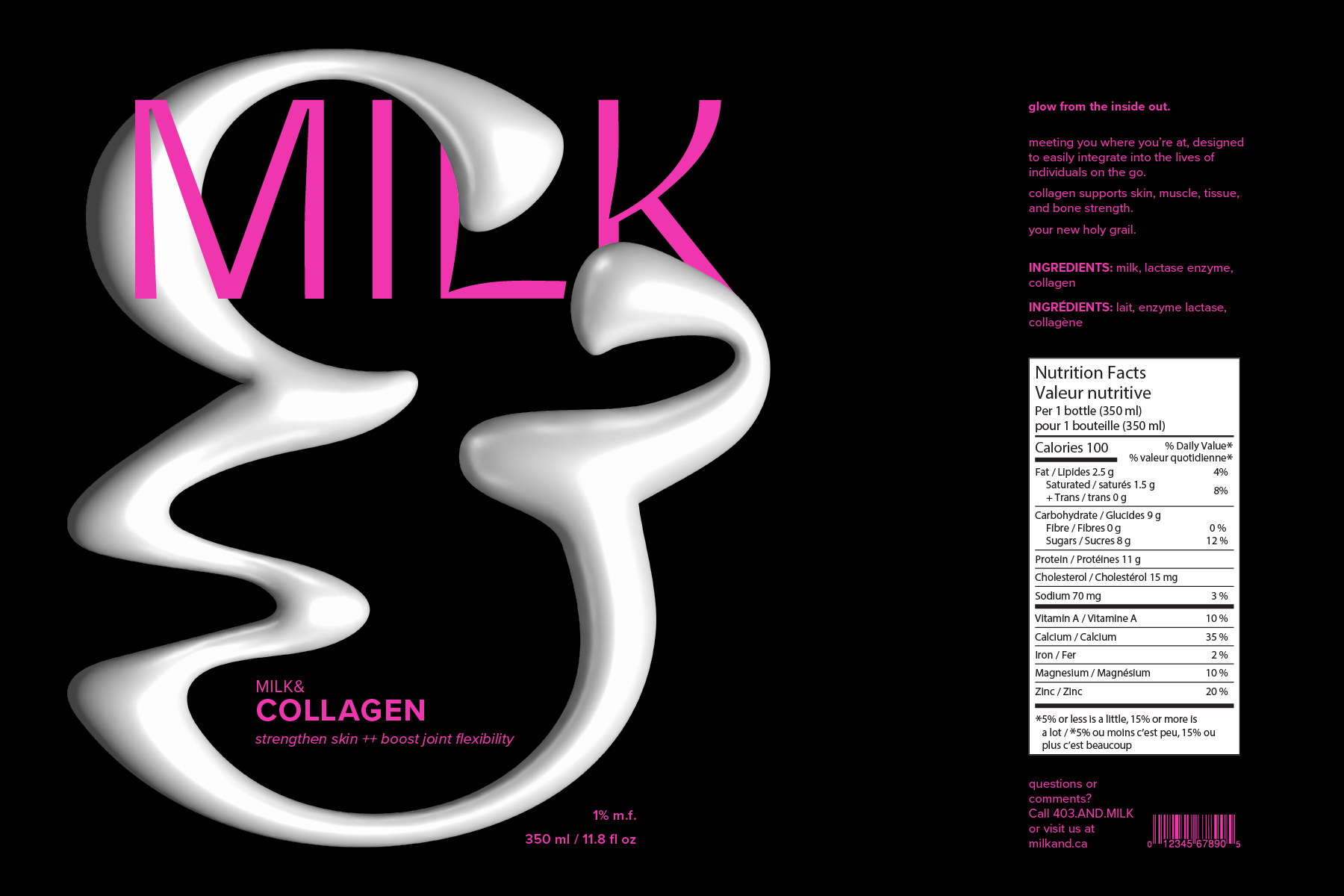
The consumption of milk has declined in Canada in recent years. Milk& takes a product we know well, and infuses it with a fresh perspective on health, convenience, and vitality. It’s all about meeting you where you’re at, designed to easily integrate into the lives of individuals on the go.
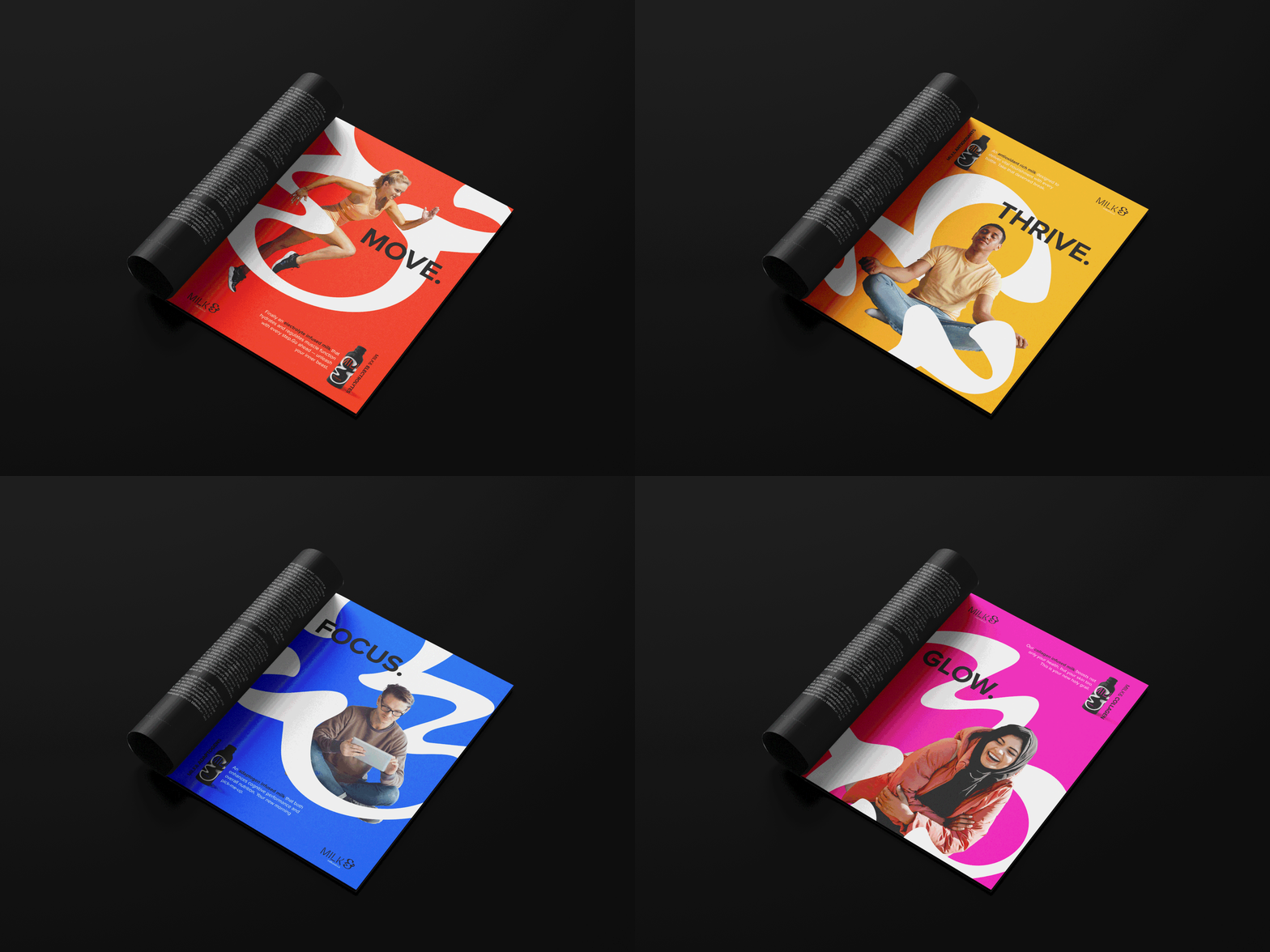
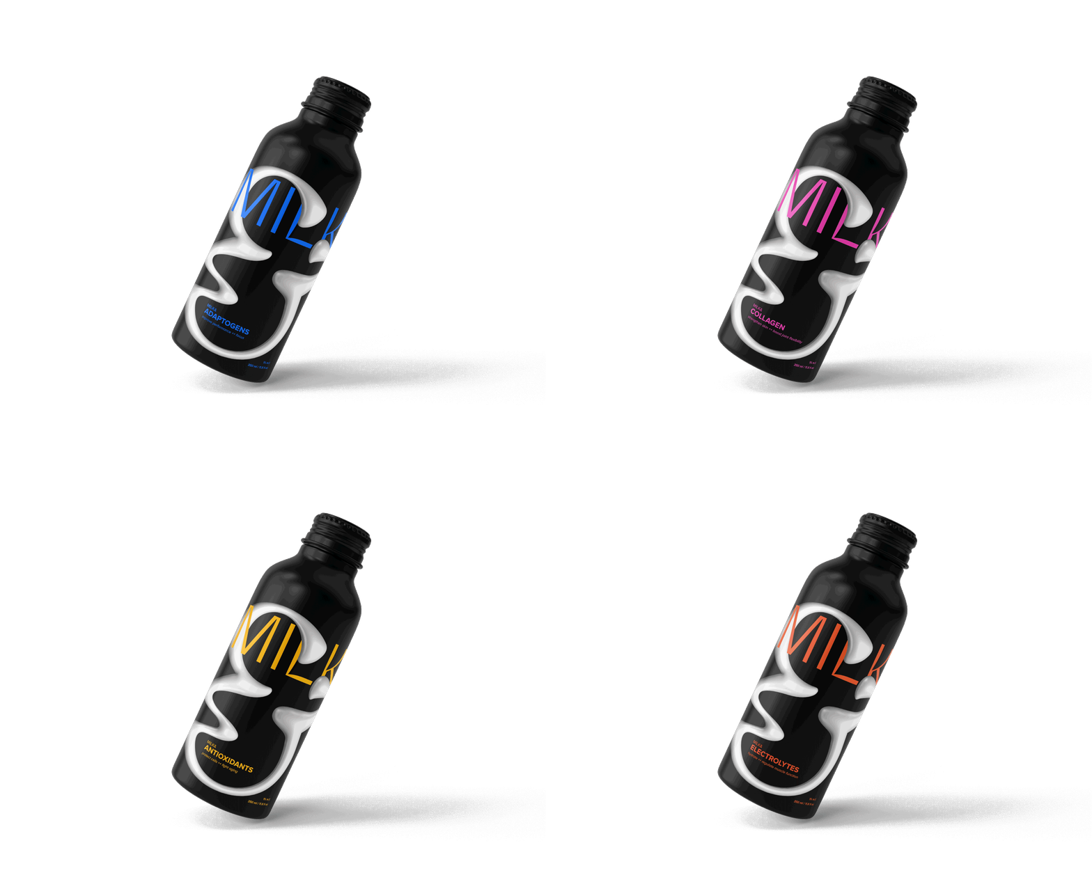
Crafted for convenience, Milk& is a nourishing companion that supports your lifestyle. It’s milk and a daily boost for those who strive for success, balance, and well-being. Milk& comes in four variations, sold by the bottle, that champion a commitment to hard work and self-care.
STUDENT WORK – AUArts
COLLABORATORS – Jayden Manzara, Hark Dhillon


Behind the Brand
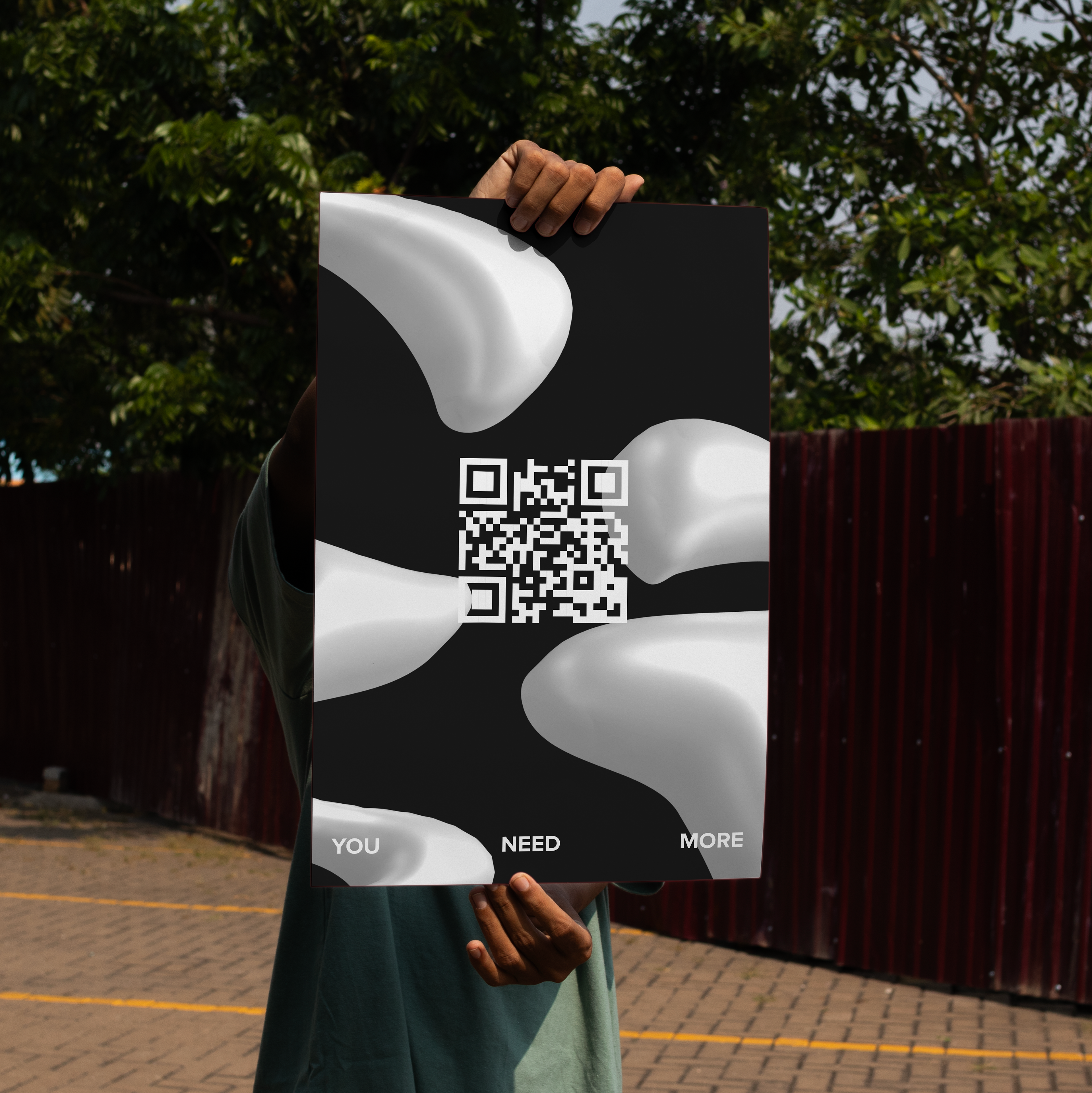
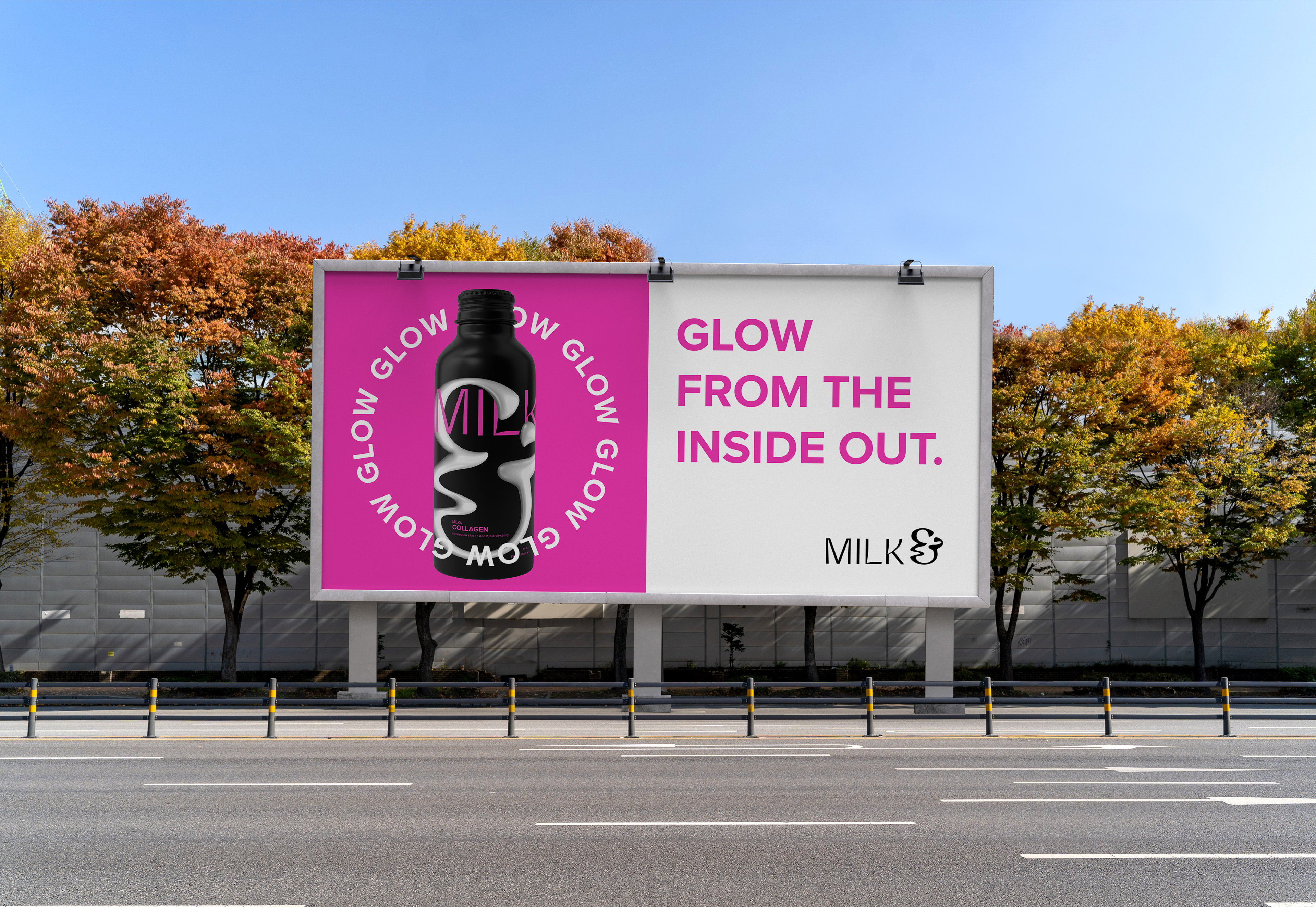
The ampersand becomes the hero of the word mark, allowing it to be used as a typographic element or stand-alone motif. It is used across packaging and marketing material to enhance audience recognition and create consistency.
The organic shape and curves of the logo are reminiscent of milk, and symbolize the fluidity of a balanced lifestyle.
Product Packaging
Social Media & Advertising
